| Labfans是一个针对大学生、工程师和科研工作者的技术社区。 | 论坛首页 | 联系我们(Contact Us) |
 |
| Labfans是一个针对大学生、工程师和科研工作者的技术社区。 | 论坛首页 | 联系我们(Contact Us) |
|
 2024-12-08, 20:21
|
#1 |
|
高级会员
注册日期: 2019-11-21
帖子: 3,025
声望力: 67  |
 Matlab toolstrip – part 8 (galleries) - undocumentedmatlab
In previous posts I showed how we can create custom Matlab app toolstrips using various controls (buttons, checkboxes, drop-downs, lists etc.). Today I will show how we can incorporate gallery panels into our Matlab toolstrip.
 Toolstrips can be a bit complex to develop so I’m proceeding slowly, with each post in the miniseries building on the previous posts. I encourage you to review the earlier posts in the Toolstrip miniseries before reading this post. Also, remember to add the following code snippet at the beginning of your code so that the relevant toolstrip classes will be recognized by Matlab: import matlab.ui.internal.toolstrip.*Gallery sub-components 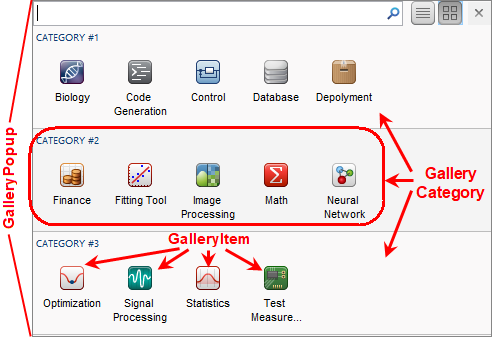 Toolstrip gallery popup components Toolstrip galleries are panels of buttons (typically large icons with an attached text label), which are grouped in “categories”. The gallery content can be presented either in-line within the toolstrip (a Gallery control), or as a drop-down button’s popup panel (a DropDownGalleryButton control). In either case, the displayed popup panel is a GalleryPopup object, that is composed of one or more GalleryCategory, each of which has one or more GalleryItem (push-button) and/or ToggleGalleryItem (toggle-button). Toolstrip gallery popup components Toolstrip galleries are panels of buttons (typically large icons with an attached text label), which are grouped in “categories”. The gallery content can be presented either in-line within the toolstrip (a Gallery control), or as a drop-down button’s popup panel (a DropDownGalleryButton control). In either case, the displayed popup panel is a GalleryPopup object, that is composed of one or more GalleryCategory, each of which has one or more GalleryItem (push-button) and/or ToggleGalleryItem (toggle-button).
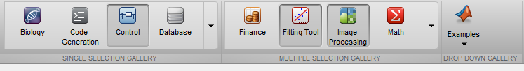
GalleryPopup We first create the GalleryPopup object, then add to it a few GalleryCategory groups of GalleryItem, ToggleGalleryItem buttons. In the example below, we use a ButtonGroup to ensure that only a single ToggleGalleryItem button is selected: import matlab.ui.internal.toolstrip.*popup = GalleryPopup('ShowSelection',true);% Create gallery categoriescat1 = GalleryCategory('CATEGORY #1 SINGLE'); popup.add(cat1);cat2 = GalleryCategory('CATEGORY #2 SINGLE'); popup.add(cat2);cat3 = GalleryCategory('CATEGORY #3 SINGLE'); popup.add(cat3);% Create a button-group to control item selectabilitygroup = matlab.ui.internal.toolstrip.ButtonGroup;% Add items to the gallery categoriesfpath = [fullfile(matlabroot,'toolbox','matlab','toolstrip','web','image') filesep]; % icons pathitem1 = ToggleGalleryItem('Biology', Icon([fpath 'biology_app_24.png']), group);item1.Description = 'Select the Biology gizmo';item1.ItemPushedFcn = @(x,y) ItemPushedCallback(x,y);cat1.add(item1);item2 = ToggleGalleryItem('Code Generation', Icon([fpath 'code_gen_app_24.png']), group);cat1.add(item2);item3 = ToggleGalleryItem('Control', Icon([fpath 'control_app_24.png']), group);cat1.add(item3);item4 = ToggleGalleryItem('Database', Icon([fpath 'database_app_24.png']), group);cat1.add(item4);... 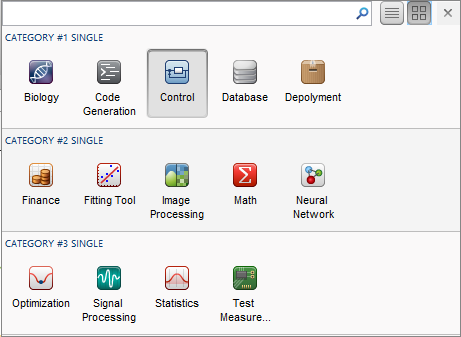 Single-selection GalleryPopup (icon view) Single-selection GalleryPopup (icon view)Note that in a real-world situation, we’d assign a Description, Tag and ItemPushedFcn to all gallery items. This was elided from the code snippet above for readability, but should be part of any actual GUI. The Description only appears as tooltip popup in icon-view (shown above), but appears as a visible label in list-view (see below). Gallery items selection: push-button action, single-selection toggle, multiple selection toggle If we use ToggleGalleryItem without a ButtonGroup, multiple gallery items can be selected, rather than just a single selection as shown above: ...item1 = ToggleGalleryItem('Biology', Icon([fpath 'biology_app_24.png']));item1.Description = 'Select the Biology gizmo';item1.ItemPushedFcn = @(x,y) ItemPushedCallback(x,y);cat1.add(item1);item2 = ToggleGalleryItem('Code Generation', Icon([fpath 'code_gen_app_24.png']));cat1.add(item2);item3 = ToggleGalleryItem('Control', Icon([fpath 'control_app_24.png']));cat1.add(item3);item4 = ToggleGalleryItem('Database', Icon([fpath 'database_app_24.png']));cat1.add(item4);... 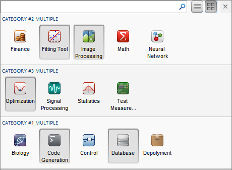 Multiple-selection GalleryPopup (icon view) Multiple-selection GalleryPopup (icon view)Alternatively, if we use GalleryItem instead of ToggleGalleryItem, the gallery items would be push-buttons rather than toggle-buttons. This enables us to present a gallery of single-action state-less push-buttons, rather than state-full toggle-buttons. The ability to customize the gallery items as either state-less push-buttons or single/multiple toggle-buttons supports a wide range of application use-cases. Customizing the GalleryPopup Properties that affect the GalleryPopup appearance are:
popup = GalleryPopup('DisplayState','list_view'); 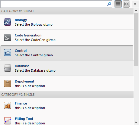 GalleryPopup (list view) GalleryPopup (list view)Switching from icon-view to list-view and back can also be done by clicking the corresponding icon near the popup’s top-right corner (next to the interactive search-box). Gallery and DropDownGalleryButton Now that we have prepared GalleryPopup, let’s integrate it in our toolstrip. We have two choices — either in-line within the toolstrip section (using Gallery), or as a compact drop-down button (using DropDownGalleryButton): % Inline gallerysection = hTab.addSection('Multiple Selection Gallery');column = section.addColumn();popup = GalleryPopup('ShowSelection',true);% add the GalleryPopup creation code abovegallery = Gallery(popup, 'MinColumnCount',2, 'MaxColumnCount',4);column.add(gallery);% Drop-down gallerysection = hTab.addSection('Drop Down Gallery');column = section.addColumn();popup = GalleryPopup();% add the GalleryPopup creation code abovebutton = DropDownGalleryButton(popup, 'Examples', Icon.MATLAB_24);button.MinColumnCount = 5;column.add(button); Clicking any of the drop-down (arrow) widgets will display the associated GalleryPopup. The Gallery and DropDownGalleryButton objects have several useful settable properties:
gallery = Gallery(popup, 'MinColumnCount',2, 'MaxColumnCount',4);gallery.TextOverlay = 'Select from these items'; 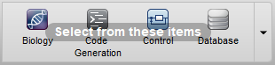 Effect of TextOverlay Effect of TextOverlayToolstrip miniseries roadmap The next post will discuss popup forms. These are similar in concept to galleries, in the sense that when we click the drop-down widget a custom popup panel is displayed. In the case of a popup form, this is a fully-customizable Matlab GUI figure. Following that, I plan to discuss toolstrip collapsibility, the Toolpack framework, docking layout, DataBrowser panel, QAB (Quick Access Bar), underlying Java controls, and adding toolstrips to figures – not necessarily in this order. Matlab toolstrips can be a bit complex, so I plan to proceed in small steps, each post building on top of its predecessors. If you would like me to assist you in building a custom toolstrip or GUI for your Matlab program, please let me know. The post Matlab toolstrip – part 8 (galleries) appeared first on Undocumented Matlab. Related posts:
More... |

|

|


 平板模式
平板模式

