| Labfans是一个针对大学生、工程师和科研工作者的技术社区。 | 论坛首页 | 联系我们(Contact Us) |
 |
| Labfans是一个针对大学生、工程师和科研工作者的技术社区。 | 论坛首页 | 联系我们(Contact Us) |
|
|
|
 2024-12-08, 20:21
|
#1 |
|
高级会员
注册日期: 2019-11-21
帖子: 3,025
声望力: 67  |
 Matlab toolstrip – part 6 (complex controls) - undocumentedmatlab
In previous posts I showed how we can create custom Matlab app toolstrips using simple controls such as buttons and checkboxes. Today I will show how we can incorporate more complex controls into our toolstrip: button groups, edit-boxes, spinners, sliders etc.
 Toolstrips can be a bit complex to develop so I’m proceeding slowly, with each post in the miniseries building on the previous posts. I encourage you to review the earlier posts in the Toolstrip miniseries before reading this post. The first place to search for potential toostrip components/controls is in Matlab’s built-in toolstrip demos. The showcaseToolGroup demo displays a large selection of generic components grouped by function. These controls’ callbacks do little less than simply output a text message in the Matlab console. On the other hand, the showcaseMPCDesigner demo shows a working demo with controls that interact with some docked figures and their plot axes. The combination of these demos should provide plenty of ideas for your own toolstrip implementation. Their m-file source code is available in the %matlabroot%/toolbox/matlab/toolstrip/+matlab/+ui/+internal/+desktop/ folder. To see the available toolstrip controls in action and how they could be integrated, refer to the source-code of these two demos. All toolstrip controls are defined by classes in the %matlabroot%/toolbox/matlab/toolstrip/+matlab/+ui/+internal/+toolstrip/ folder and use the matlab.ui.internal.toolstrip package prefix, for example: % Alternative 1:hButton = matlab.ui.internal.toolstrip.Button;% Alternative 2:import matlab.ui.internal.toolstrip.*hButton = Button;For the remainder of today’s post it is assumed that you are using one of these two alternatives whenever you access any of the toolstrip classes. Top-level toolstrip controls ControlDescriptionImportant propertiesCallbacksEventsEmptyControlPlaceholder (filler) in container column(none)(none)(none)LabelSimple text label (no action)Icon, Text (string)(none)(none)ButtonPush-buttonIcon, Text (string)ButtonPushedFcnButtonPushedToggleButtonToggle (on/off) buttonIcon, Text (string), Value (logical true/false), ButtonGroup (a ButtonGroup object)ValueChangedFcnValueChangedRadioButtonRadio-button (on/off)Text (string), Value (logical true/false), ButtonGroup (a ButtonGroup object)ValueChangedFcnValueChangedCheckBoxCheck-box (on/off)Text (string), Value (logical true/false)ValueChangedFcnValueChangedEditFieldSingle-line editboxValue (string)ValueChangedFcnValueChanged, FocusGained, FocusLostTextAreaMulti-line editboxValue (string)ValueChangedFcnValueChanged, FocusGained, FocusLostSpinnerA numerical spinner control of values between min,maxLimits ([min,max]), StepSize (integer), NumberFormat (‘integer’ or ‘double’), DecimalFormat (string), Value (numeric)ValueChangedFcnValueChanged, ValueChangingSliderA horizontal slider of values between min,maxLimits ([min,max]), Labels (cell-array), Ticks (integer), UseSmallFont (logical true/false, R2018b onward), ShowButton (logical true/false, undocumented), Steps (integer, undocumented), Value (numeric)ValueChangedFcnValueChanged, ValueChangingListBoxList-box selector with multiple itemsItems (cell-array), SelectedIndex (integer), MultiSelect (logical true/false), Value (cell-array of strings)ValueChangedFcnValueChangedDropDownSingle-selection drop-down (combo-box) selectorItems (cell-array), SelectedIndex (integer), Editable (logical true/false), Value (string)ValueChangedFcnValueChangedDropDownButtonButton that has an associated drop-down selectorIcon, Text (string), Popup (a PopupList object)DynamicPopupFcn(none)SplitButtonSplit button: main clickable part next to a drop-down selectorIcon, Text (string), Popup (a PopupList object)ButtonPushedFcn, DynamicPopupFcnButtonPushed, DropDownPerformed (undocumented)GalleryA gallery of selectable options, displayed in-panelMinColumnCount (integer), MaxColumnCount (integer), Popup (a GalleryPopup object), TextOverlay (string)(none)(none)DropDownGalleryButtonA gallery of selectable options, displayed as a drop-downMinColumnCount (integer), MaxColumnCount (integer), Popup (a GalleryPopup object), TextOverlay (string)(none)(none)In addition to the control properties listed in the table above, all toolstrip controls share some common properties:
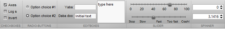
Button groups A ButtonGroup binds several CheckBox and ToggleButton components such that only one of them is selected (pressed) at any point in time. For example: hSection = hTab.addSection('Radio-buttons');hColumn = hSection.addColumn();% Grouped RadioButton controlshButtonGroup = ButtonGroup;hRadio = RadioButton(hButtonGroup, 'Option choice #1');hRadio.ValueChangedFcn = @ValueChangedCallback;hColumn.add(hRadio);hRadio = RadioButton(hButtonGroup, 'Option choice #2');hRadio.ValueChangedFcn = @ValueChangedCallback;hRadio.Value = true;hColumn.add(hRadio); 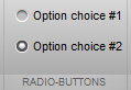 Toolstrip ButtonGroup Note that unlike the uibuttongroup object in “standard” figure GUI, the toolstrip’s ButtonGroup object does not have a SelectionChangedFcn callback property (or corresponding event). Instead, we need to set the ValueChangedFcn callback property (or listen to the ValueChanged event) separately for each individual control. This is really a shame – I think it would make good design sense to have a SelectionChangedFcn callback at the ButtonGroup level, as we do for uibuttongroup (in addition to the individual control callbacks). Toolstrip ButtonGroup Note that unlike the uibuttongroup object in “standard” figure GUI, the toolstrip’s ButtonGroup object does not have a SelectionChangedFcn callback property (or corresponding event). Instead, we need to set the ValueChangedFcn callback property (or listen to the ValueChanged event) separately for each individual control. This is really a shame – I think it would make good design sense to have a SelectionChangedFcn callback at the ButtonGroup level, as we do for uibuttongroup (in addition to the individual control callbacks).Also note that the internal documentation of ButtonGroup has an error – it provides an example usage with RadioButton that has its constructor inputs switched: the correct constructor is RadioButton(hButtonGroup,labelStr). On the other hand, for ToggleButton, the hButtonGroup input is the [optional] 3rd input arg of the constructor: ToggleButton(labelStr,Icon,hButtonGroup). I think that it would make much more sense for the RadioButton constructor to follow the documentation and the style of ToggleButton and make the hButtonGroup input the last (2nd, optional) input arg, rather than the 1st. In other words, it would make more sense for RadioButton(labelStr,hButtonGroup), but unfortunately this is currently not the case. Label, EditField and TextArea A Label control is a simple non-clickable text label with an optional Icon, whose text is controlled via the Text property. The label’s alignment is controlled by the containing column’s HorizontalAlignment property. An EditField is a single-line edit-box. Its string contents can be fetched/updated via the Value property, and when the user updates the edit-box contents the ValueChangedFcn callback is invoked (upon each modification of the string, i.e. every key-click). This is a pretty simple control actually. The EditField control has a hidden (undocumentented) settable property called PlaceholderText, which presumably aught to display a gray initial prompt within the editbox. However, as far as I could see this property has no effect (perhaps, as the name implies, it is a place-holder for a future functionality…). A TextArea is another edit-box control, but enables entering multiple lines of text, unlike EditField which is a single-line edit-box. TextArea too is a very simple control, having a settable Value string property and a ValueChangedFcn callback. Whereas EditField controls, being single-line, would typically be included in 2- or 3-element toolstrip columns, the TextArea would typically be placed in a single-element column, so that it would span the entire column height. A peculiarity of toolstrip columns is that unless you specify their Width property, the internal controls are displayed with a minimal width (the width is only controllable at the column level, not the control-level). This is especially important with EditField and TextArea controls, which are often empty by default, causing their assigned width to be minimal (only a few pixels). This is corrected by setting their containing column’s Width: % EditField controlscolumn1 = hSection.addColumn('HorizontalAlignment','right');column1.add(Label('Yaba:'))column1.add(Label('Daba doo:'))column2 = hSection.addColumn('Width',70);column2.add(EditField);column2.add(EditField('Initial text'));% TextArea controlcolumn3 = hSection.addColumn('Width',90);hEdit = TextArea;hEdit.ValueChangedFcn = @ValueChangedCallback;column3.add(hEdit); 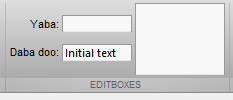 Toolstrip Label, EditField and TextArea Toolstrip Label, EditField and TextAreaSpinner Spinner is a single-line numeric editbox that has an attached side-widget where you can increase/decrease the editbox value by a specified amount, subject to predefined min/max values. If you try to enter an illegal value, Matlab will beep and the editbox will revert to its last acceptable value. You can only specify a NumberFormat of ‘integer’ or ‘double’ (default: ‘integer’) and a DecimalFormat which is a string composed of the number of sub-decimal digits to display and the format (‘e’ or ‘f’). For example, DecimalFormat=’4f’ will display 4 digits after the decimal in floating-point format (‘e’ means engineering format). Here is a short usage example (notice the different ways that we can set the callbacks): hColumn = hSection.addColumn('Width',100);% Integer spinner (-100 : 10 : 100)hSpinner = Spinner([-100 100], 0); % [min,max], initialValuehSpinner.Description = 'this is a tooltip description';hSpinner.StepSize = 10;hSpinner.ValueChangedFcn = @ValueChangedCallback;hColumn.add(hSpinner);% Floating-point spinner (-10 : 0.0001 : 10)hSpinner = Spinner([-10 10], pi); % [min,max], initialValuehSpinner.NumberFormat = 'double';hSpinner.DecimalFormat = '4f';hSpinner.StepSize = 1e-4;addlistener(hSpinner,'ValueChanged', @ValueChangedCallback);addlistener(hSpinner,'ValueChanging',@ValueChangingCallback);hColumn.add(hSpinner); 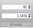 Toolstrip Spinner A logical extension of the toolstrip spinner implementation would be for non-numeric spinners, as well as custom Value display formatting. Perhaps this will become available at some future Matlab release. Toolstrip Spinner A logical extension of the toolstrip spinner implementation would be for non-numeric spinners, as well as custom Value display formatting. Perhaps this will become available at some future Matlab release.Slider Slider is a horizontal ruler on which you can move a knob from the left (min Value) to the right (max Value). The ticks and labels are optional and customizable. Here is a simple example showing a plain slider (values between 0-100, initial value 70, ticks every 5, labels every 20, step size 1), followed by a custom slider (notice again the different ways that we can set the callbacks): hColumn = hSection.addColumn('Width',200);hSlider = Slider([0 100], 70); % [min,max], initialValuehSlider.Description = 'this is a tooltip';tickVals = 0 : 20 : 100;hSlider.Labels = [compose('%d',tickVals); num2cell(tickVals)]'; % {'0',0; '20',20; ...}hSlider.Ticks = 21; % =numel(0:5:100)hSlider.ValueChangedFcn = @ValueChangedCallback;hColumn.add(hSlider);hSlider = Slider([0 100], 40); % [min,max], initialValuehSlider.Labels = {'Stop' 0; 'Slow' 20; 'Fast' 50; 'Too fast' 75; 'Crash!' 100};try hSlider.UseSmallFont = true; catch, end % UseSmallFont was only added in R2018bhSlider.Ticks = 11; % =numel(0:10:100)addlistener(hSlider,'ValueChanged', @ValueChangedCallback);addlistener(hSlider,'ValueChanging',@ValueChangingCallback);hColumn.add(hSlider); 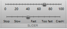 Toolstrip Slider Toolstrip SliderToolstrip miniseries roadmap The next post will discuss complex selection components, including listbox, drop-down, split-button, and gallery. Following that, I plan to discuss toolstrip collapsibility, the ToolPack framework, docking layout, DataBrowser panel, QAB (Quick Access Bar), underlying Java controls, and adding toolstrips to figures – not necessarily in this order. Matlab toolstrips can be a bit complex, so I plan to proceed in small steps, each post building on top of its predecessors. If you would like me to assist you in building a custom toolstrip or GUI for your Matlab program, please let me know. The post Matlab toolstrip – part 6 (complex controls) appeared first on Undocumented Matlab. Related posts:
More... |

|

|


 混合模式
混合模式
